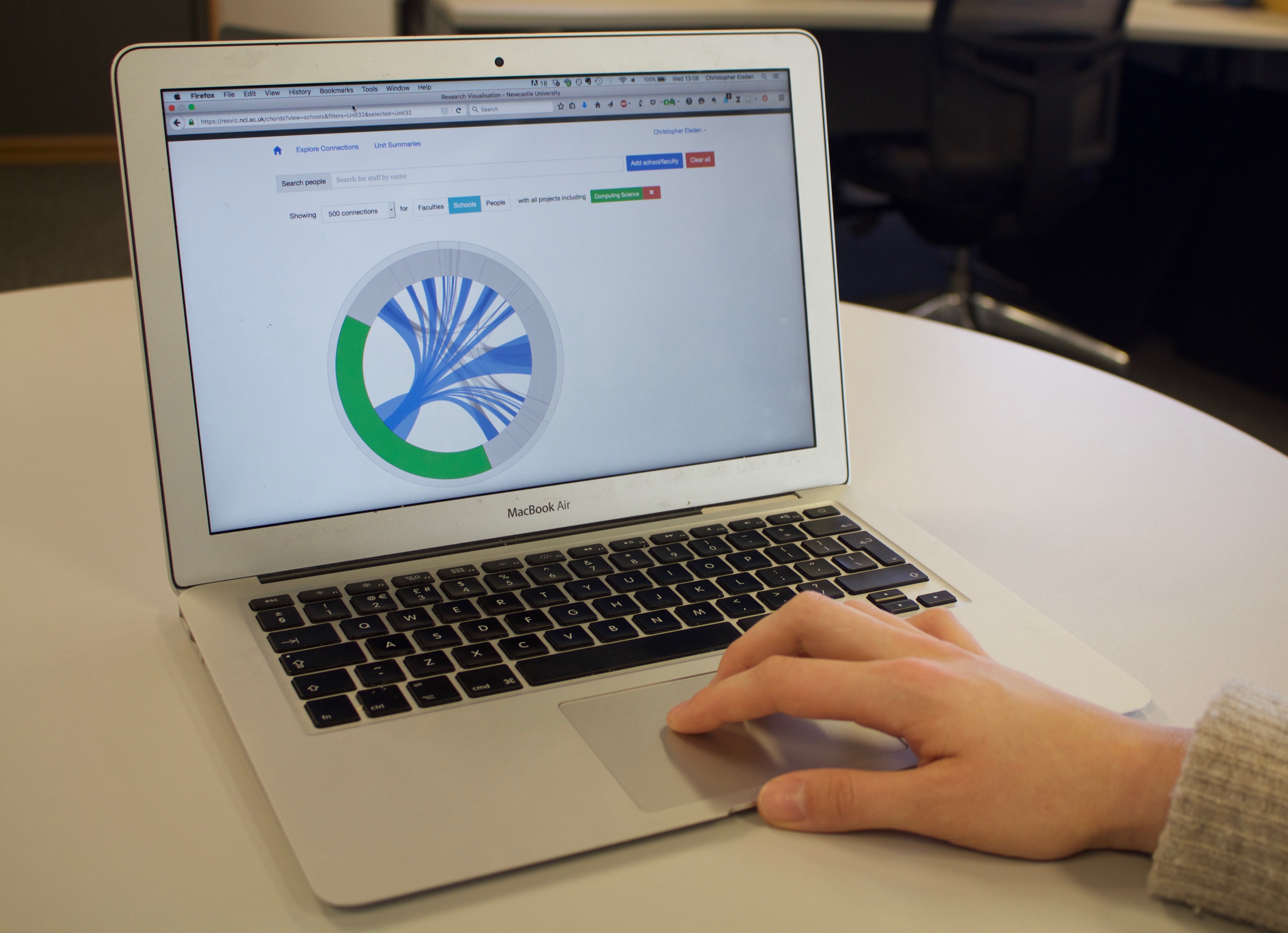
ResViz is a web based tool for exploring research based collaborations between individuals, departments, and faculties through currently active funded university projects. The visualisation also depicts relative splits and total project values provide additional context to the relationships and an overview of the research funding landscape of the university. The tool was designed and developed by colleagues at Culture Lab, Seb Mellor and Rob Comber, and I’ve led an interview study with key stakeholders and users, from senior management to early-career academics, to understand how this tool would be used, adopted and perhaps contested.
This work raises the question of what happens when workplace metrics are made public and transparent. What are the consequences of making this sort of professional data highly accessible and transparent? How is this tool employed differently by managers and academics? How can we design a visualisation that helps people ask the right questions, rather than determine the wrong answers?
It’s also an opportunity to contribute empirically to debates, especially in a UK context, about the use of metrics in the modern ‘neoliberal’ university. Finally it’s another site to examine interactions with a data-driven life, as the data represents aspects of one’s professional identity.
We’ve presented this work at the first ‘Accelerated Academy’ conference in 2015, and subsequently published a blog post on the LSE Social Impact blog.
We’re also presenting this work at CHI 2016, where we report our findings, and identify 7 design issues in visualizing metrics – (pdf).
Chris Elsden, Seb Mellor, Pete Wheldon, Patrick Olivier, David Kirk, Rob Comber
